1.Blog forum

What is an infographic?
What is an infographic?
Visualisation has been a problem for a very long time, like from the ancient Egyptians.
Infographic are like the modern representation of hieroglyphics; the only difference is that we use them to differentiate the male toilet from the female one.
Infographics have been used specially to deliver stories about data, in fact data tell stories and stories need to be entertaining and easy to follow.
William Playfair was a spy, like in the James Bond movies and also a good engineer. He invented the pie chart as well. Hence, he was considered the father of the infographic in the 1700s. Edward R. Tufte contributed by writing in 1983 “The Visual Display of Quantitative Information”, emphasising that evidence as data can and should be beautifully represented.
Infographics became really popular around 2005 when Google shared that people were willing to open an infographic 800 times more than other type of content.
Analysing the success of the infographic is quite clear that our brain digests faster information when are chunked and when there is only short text. It is also important that a pleasant visualisation will make data easy to remember.
Infographics can be quite fun to read and they should be. Context and content should be strongly respected with a simple metaphor to deliver the right message matching audience.
Creating infographic forces the author to visualise information in a clear visual hierarchy and it forces them to think about the audience that will consume that information.
How to create a great infographic?
Plan it carefully. Defining what data are important, understanding audience and what information we have available.
Be bold. One of the aspects of the infographic is that it needs to be memorable, it is important that there is a balanced between data, graphics and negative space in order to design a good information architecture.
Short copy. People like this visualisation because they don’t have to read too much.
Be relevant. What data are displayed will make the difference from a good infographic to bad one.
Defining relationship between data. Data need context and information for the audience to anchor them, also it is fundamental that information displayed are relatable.
REFERENCES:
Simple Infographic Maker Tool by Easelly. 2019. VIDEO: The History Of Infographics. [online] Available at: <https://www.easel.ly/blog/the-history-of-infographics/> [Accessed 23 March 2020].
Edwardtufte.com. 2020. The Work Of Edward Tufte And Graphics Press. [online] Available at: <https://www.edwardtufte.com/tufte/> [Accessed 23 March 2020].
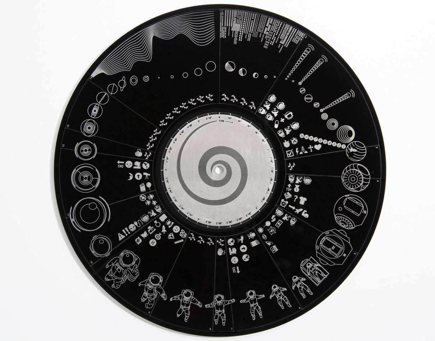
Some good ones

Evolution of video games controller is an amasing infographic with a consistent narrative and a simple visualisation to reduce the overall complexity due to the amount of information

Aesthetically pleasant visualisation of Santiago De Compostela walk

Extremely funny and visually sophisticated this one is one of my favorite infographic


https://swanh.net/ longest infographic I ever seen